Guide
Help consultants narrow the field.
A guided in-store experience that made a wall of choice easier to navigate—while giving customers and consultants a more confident way to shop together.
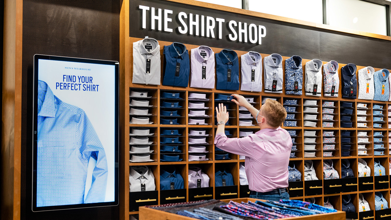
Men’s Wearhouse needed a more confident way to shop a dense assortment—without weakening the expertise of its store consultants.
Use the screen to guide the conversation.
Help consultants narrow the field.
Turn a wall of choice into a short list.
Connect style and fit to a recommendation.
We began with 14 possible digital concepts. Through user testing, the team prioritized an interactive shirt wall: take a short style quiz, generate recommendations, compare a focused set of options, and choose what to try on, buy, or save to a customer profile.
The system moved from inspiration to recommendation while keeping try-on and the consultant relationship in view.
The shirt wall was designed for ADA compliance across seated and standing reach ranges. The control surface could move to meet the customer, keeping the same core experience available to people using wheelchairs as well as shorter and taller customers.
The interface position adapts without creating a separate or reduced path.
The interaction stayed within reachable areas across different heights and mobility needs.
Placement made digital guidance feel like part of shopping the wall, not a detached kiosk.
A radial menu kept primary actions close to the customer’s touch point and reduced long trips across a large-format screen. States and transitions were designed together so the interface could stay legible while the surrounding merchandise remained the focus.

The final motion language gave the result a sense of reveal while preserving a direct path to product. It brought energy to the experience without slowing down the customer or the consultant.
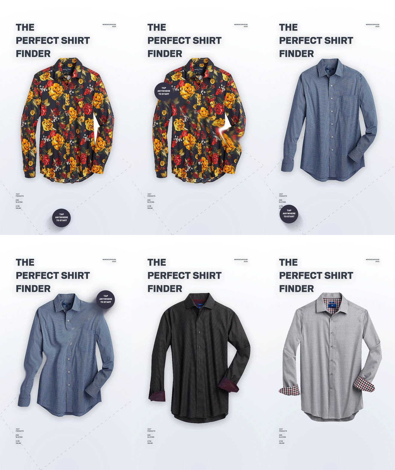
The result tied the customer’s answers to a clear recommendation that could be found and tried on in the store.
My role as Creative Director at Valtech was to hold the concept, environment, interface, and motion together as one experience. The strongest outcome was a simple one: customers gained confidence, while store consultants gained a more useful way to guide the conversation.
The design made a large assortment feel personal—and made inclusion part of the system from the beginning.